Vista Sans Wood Type Project Letterpress / Digital Fabrication / Collaboration / Book
The Vista Sans Wood Type Project was initiated in 2011 in collaboration with Tricia Treacy and continued over the following two years as an exploration of digital fabrication, letterpress printing and collabortive practice. In this case, we aimed to utilize digital fabrication technologies to produce a hybrid form of typographic design where the production process is ingrained in the product.
Letterpress wood type has an inherent printed character that acerbates traditional printers and titillates contemporary graphic designers. The unique visual and tactile impact of letterpress has gained much popularity in the last decade, which I believe can be attributed to a yearning for corporeal experience in the wake of the digital revolution. The post-digital reality we now live in is composed of artists and designers operating between digital and analog systems, between cognitive/on-screen and physical/offscreen experiences, between high tech and high touch. Artists and designers operating this way “understand the benefits, appeal and importance of the materiality and tangibility of technologies compared with the all-digital and immaterial that prevailed at the start of the digital era.” Further, with digital technologies readily available and humanized (i.e., D.I.Y.) post-digital artists and designers are able to experiment with the blending of archaic and modern processes of production, with the values of each embedded into the product.

We started with a contemporary Emigre typeface, Vista Sans, designed by Xavier Dupré, because it was created as a blend of, to quote the designer: “the rhythm of blackletters; big contrast, emphasis on the vertical, graphic and strong looking” and “humanist shapes.”
This mix of graphic/mechanical form and a styling rooted in the human hand is paired with a similar production process: the mechanization of a Computer Numerically Controlled (CNC) router and the anomalous (human) nature of wood type and letterpress printing. We wanted to emphasize the grain of the wood in the printed letterforms, choosing to mostly use side-grain or low-quality plywood instead of traditional milled/planed end-grain wood, to infuse the material with meaning.

In the spirit of collaborative, interdisciplinary artistic practice, which we both embrace, we wanted to expand the scope of this project by inviting international artists/designers/printmakers to print with the type. We asked 20 individuals, collaborative groups or studios if they would be interested in joining the project. We said we would send them a set of wood type (either five-inch or seven-inch high side-grain oak or ash) and bristol paper (donated by Legion Paper of New York), if they would send back an edition of 40 prints. We would then send them a set of all 21 prints (Tricia and I would print a collaborative edition also), and be left with 10—15 sets for exhibitions and collectors.

We were challenging the artists/designers/printmakers to agree to a certain amount of limitations, which would provide cohesion for all the prints. These limitations included (1) they must print with the type provided, (2) they must use the paper we provided, and (3) they must agree to deliver the prints on time. However, they were allowed to add any other elements to their prints, and cut the paper to any size they wished. Additionally, and unbeknownst to them, they all received the same five letters (t, o, u, c, h), in either five-inch or seven-inch wood type. The word “touch” is conceptually connected to the corporeal phenomena and materiality of wood type, printmaking processes and the post-digital nature of a purpose-built CNC router.

Our idea was well received by the artists/designers (they all said yes), and we launched a website for participants to post process documentation and for others to learn more about the project. This has also allowed the artists/designers to see what other participants have been up to. The website has been invaluable in providing a central location for all information related to the project and images of the prints.
The final set of prints contains twenty-one original works:
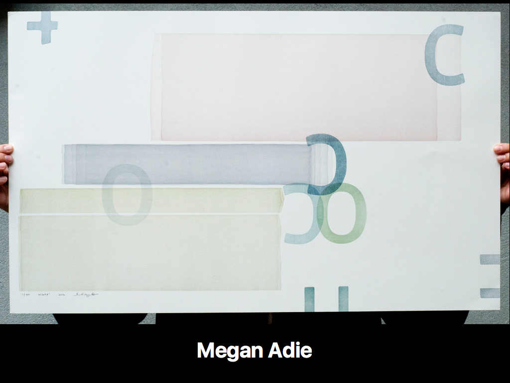


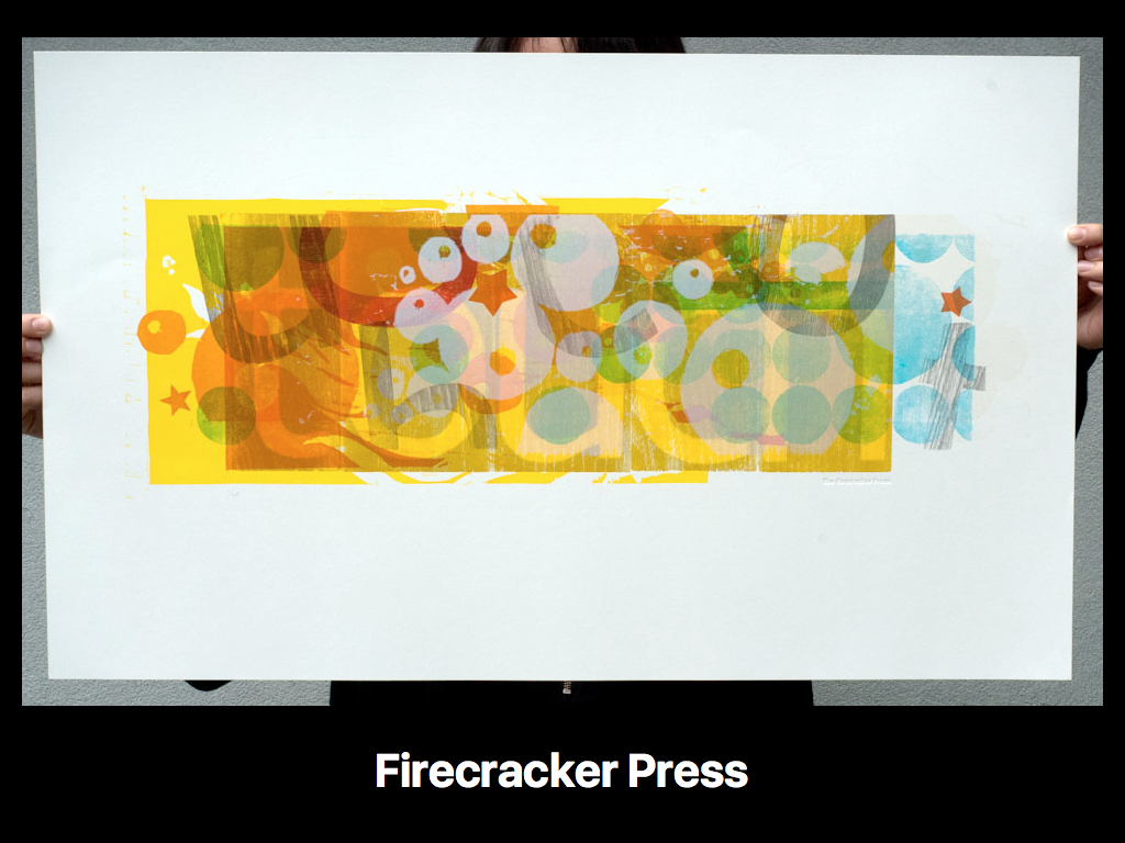

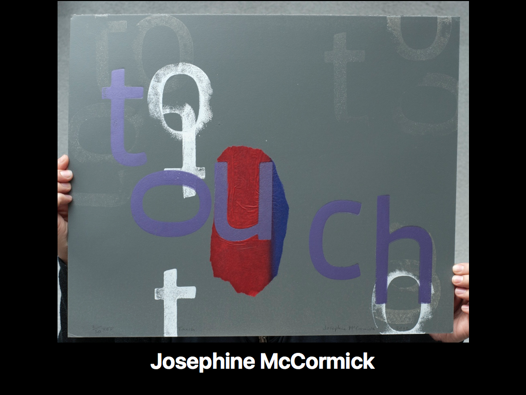
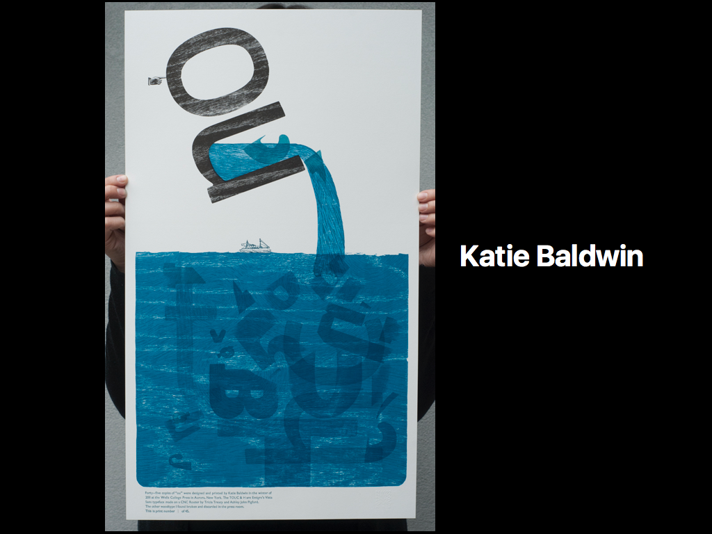


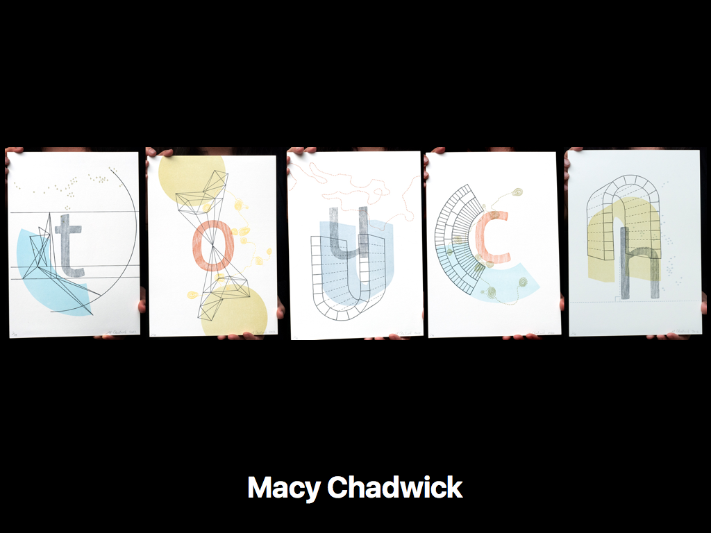
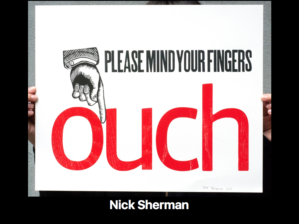


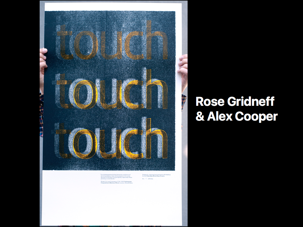
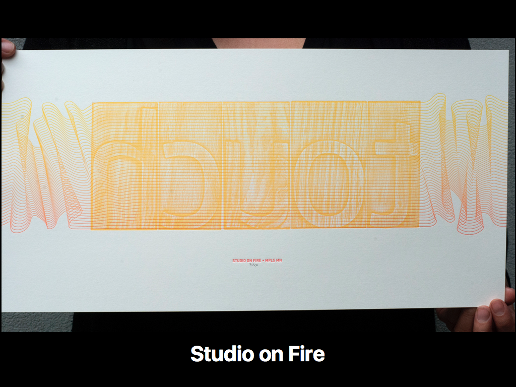
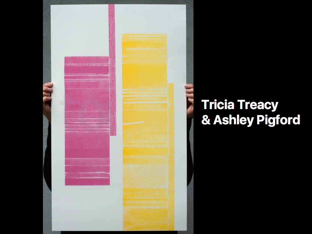


These prints represent very contemporary and experimental approaches to letterpress printing that incorporate digital fabrication techniques, tools and artifacts; they are a blend of high tech and low tech processes. Each participant incorporated their own unique methods and perspectives of the concept of touch, with the wood type as the only common element. These prints stand as testament to the creative potential of collaborative artistic practices.
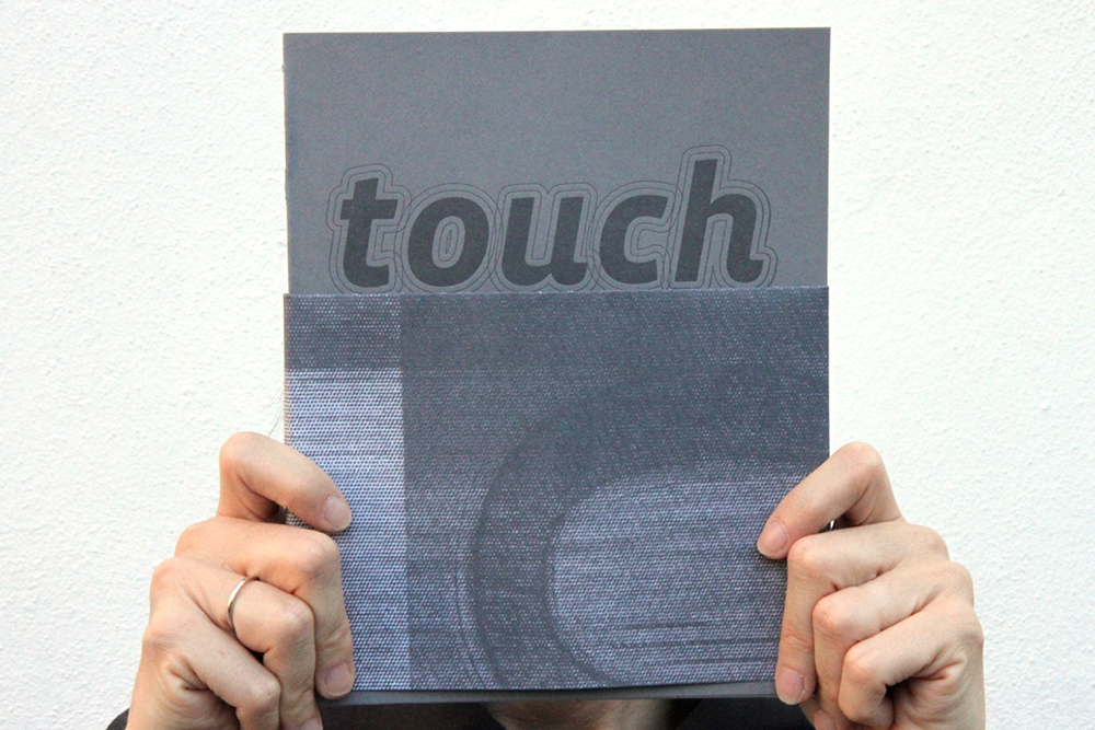
Tricia and I wanted to share the artists' processes in their own words. In 2013 we crowdfunded $18,062 through kickstarter.com to create and self-publish a book that would do just that. The Vista Sans Wood Type Project Book was the result of this effort.
We officially released this book at Typo Berlin in May of 2013. It is a product of digital offset, risograph and letterpress printing. The books are hand-bound by Tricia and her assistants, and include two spreads for each participant and contributed essays by Steven Heller, John D. Berry, Amze Emmons and Catherine Dixon. This book is out of print and unfortunately no longer available for purchase, but you can view it as a PDF.
© Ashley John Pigford, All rights reserved.